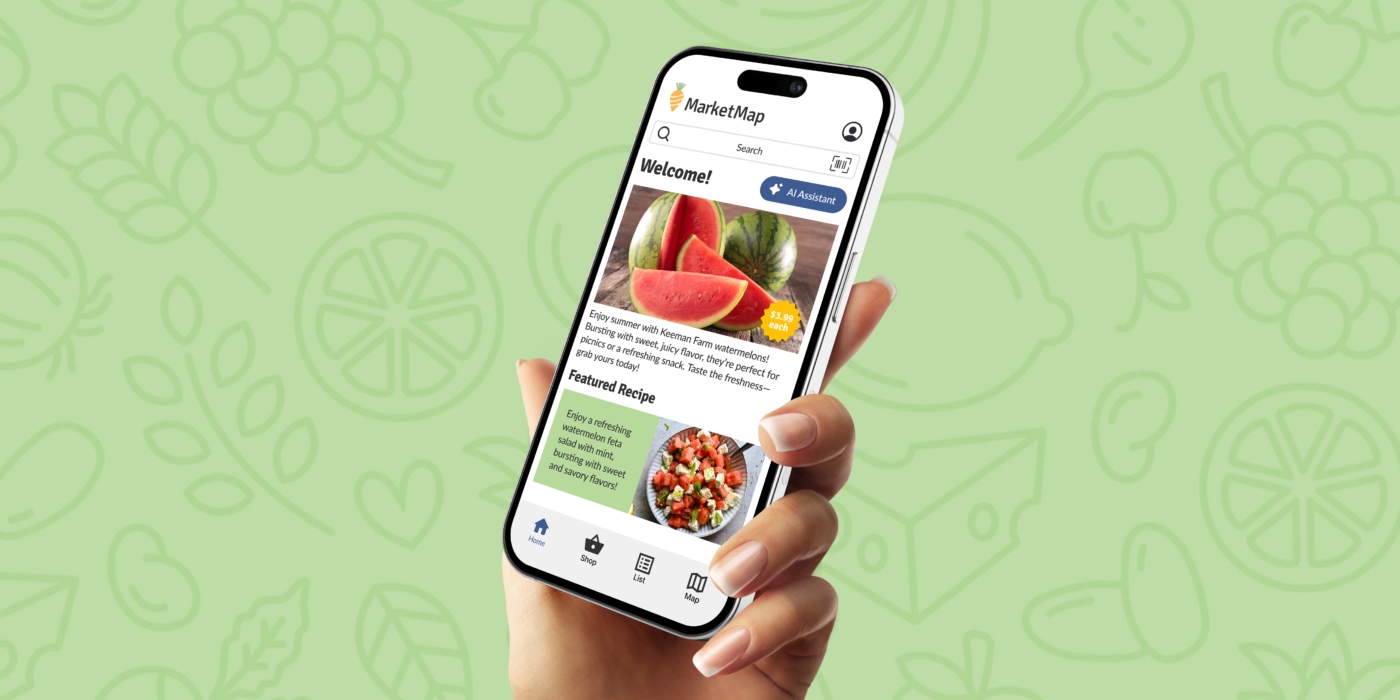
Design an app for a local grocery store that helps shoppers locate products as they shop in person.
The Challenge: Many people find grocery shopping to be both time-consuming and frustrating.
The Solution: Develop an app that enhances and streamlines the grocery shopping experience.
Research
In my user research, I interviewed a diverse group of individuals who initially expressed a desire to simply get in and out of the grocery store as quickly as possible. However, the findings revealed a deeper preference for a more enjoyable and engaging shopping experience. Participants valued discovering new foods, exploring healthy alternatives, finding discounts, and accessing recipes. This insight highlighted that while efficiency is important, shoppers also seek a rewarding and enriching experience that enhances their overall grocery shopping journey.
Pain Point: Accessibility
Users should be able to identify different types of foods through both descriptions and images by implementing accessible features.
Pain Point: Navigation
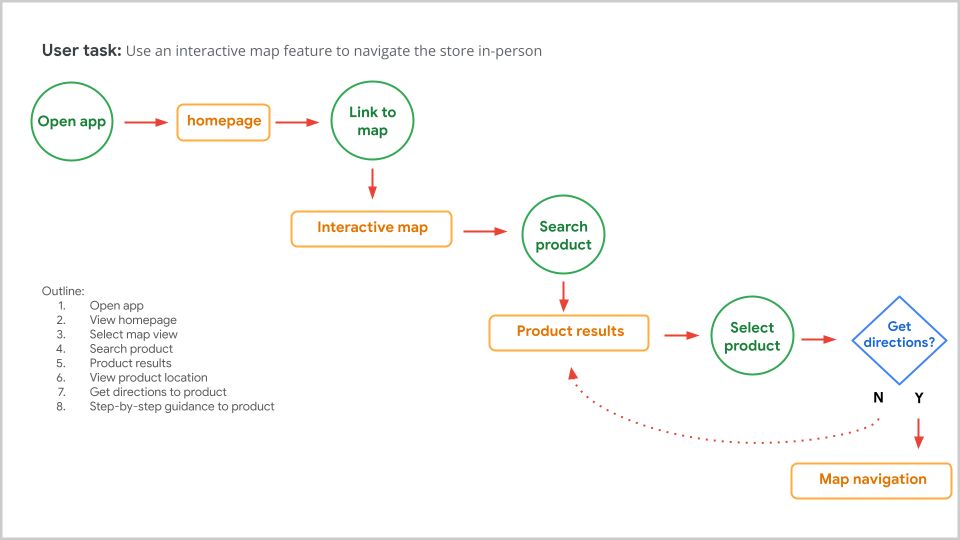
Users need to be able to physically move through the store while holding a device, so prioritizing intuitive guidance is essential.
Pain Point: Inventory
Users need to determine if their desired product is in stock and discover alternative options through personalized features.
Pain Point: Efficiency
Users should be able to make the most of their time spent in the store.
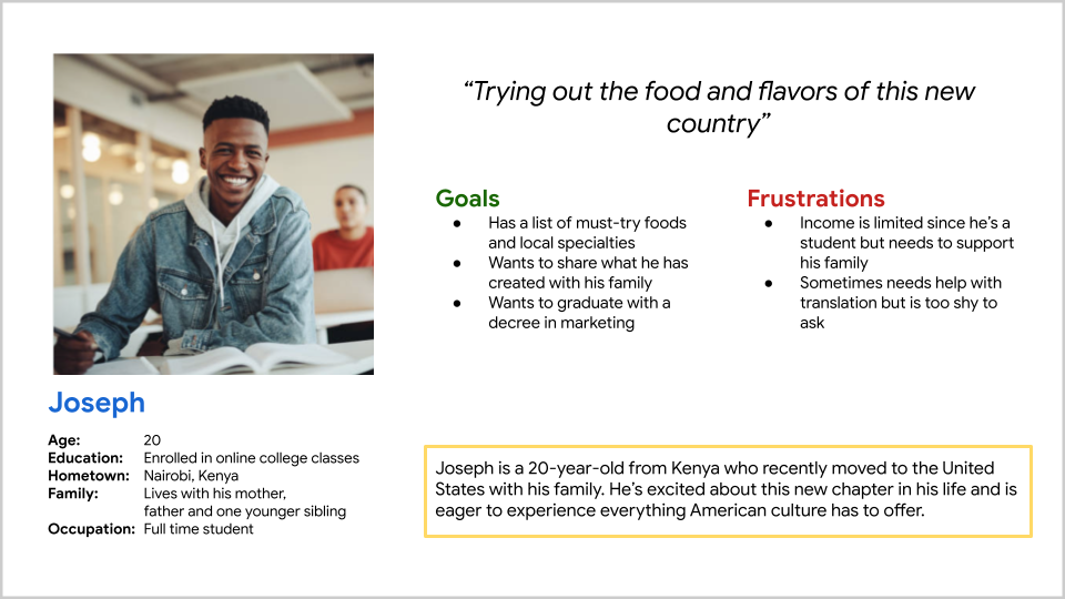
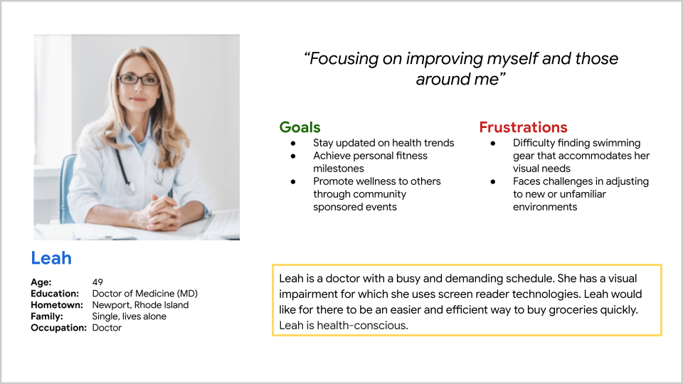
Personas
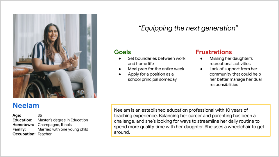
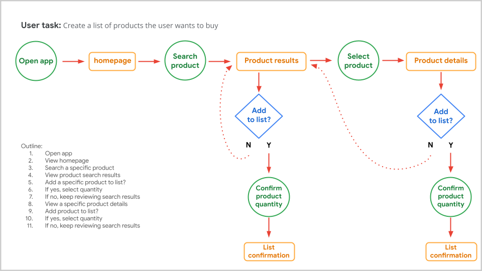
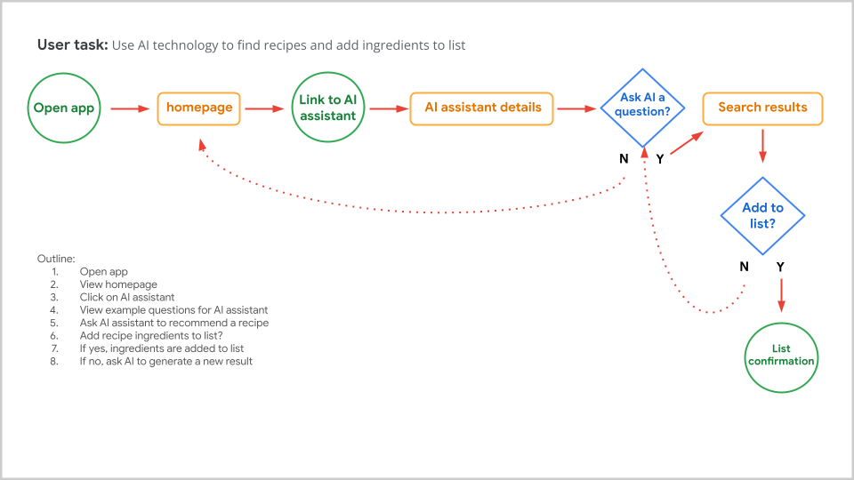
Userflow
Wireframes
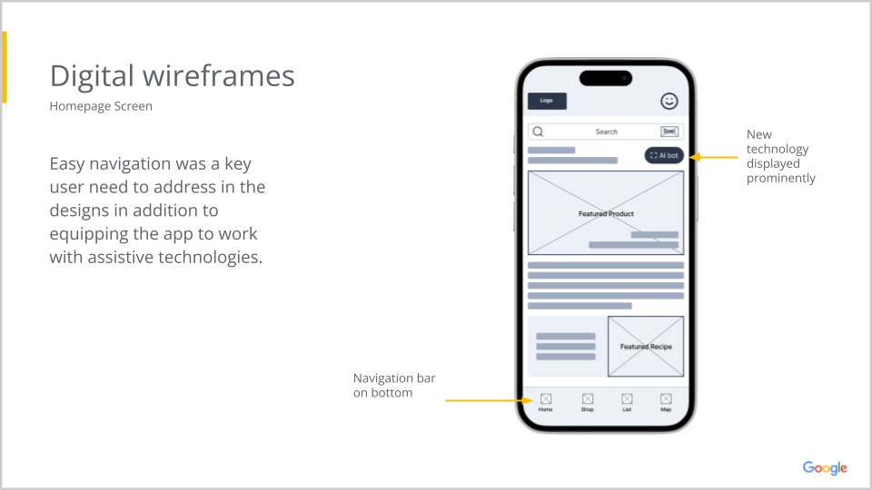
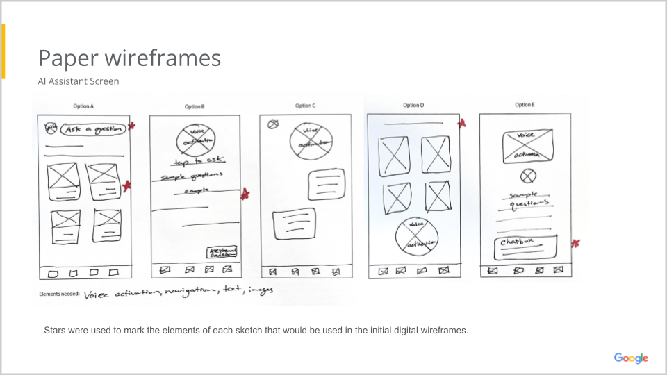
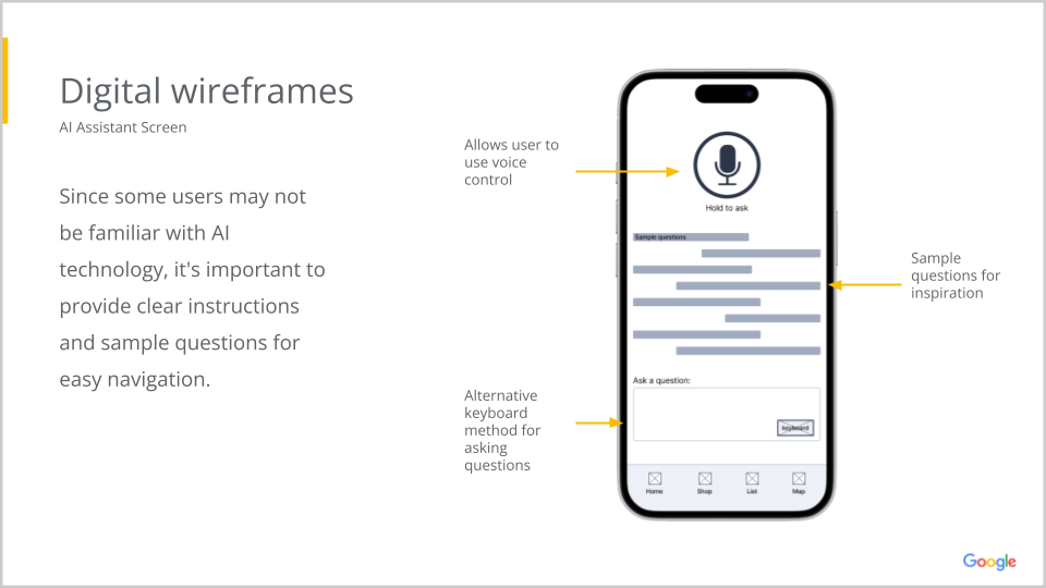
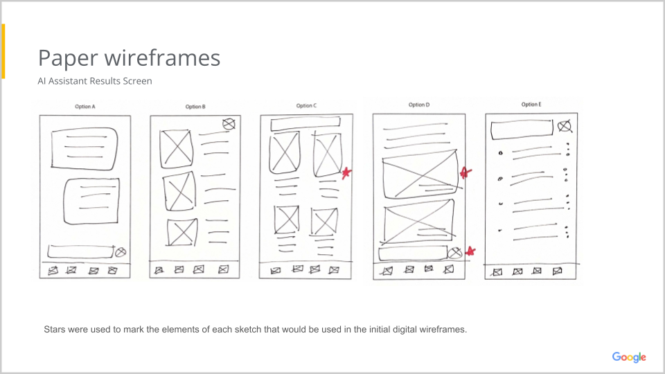
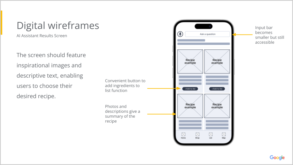
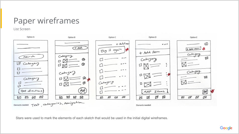
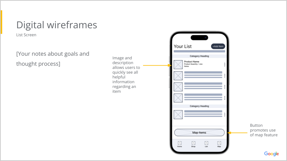
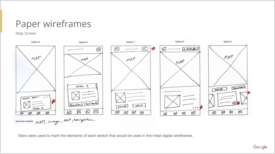
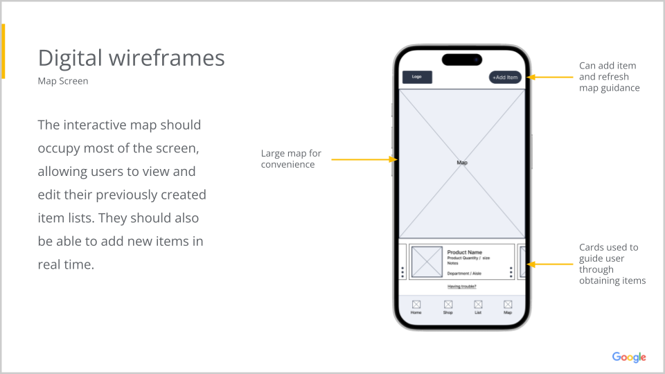
Low Fidelity Prototype

Usability Study: Findings
In my usability studies, I aimed to evaluate user interactions with my platform and identify areas for improvement. These insights will guide my ongoing efforts to enhance user experience and streamline functionality.
Key Insights:
- Users want an easier way to edit their list
- Users want a way to shop for items without the AI assistant
- Users expected the home screen images to be clickable
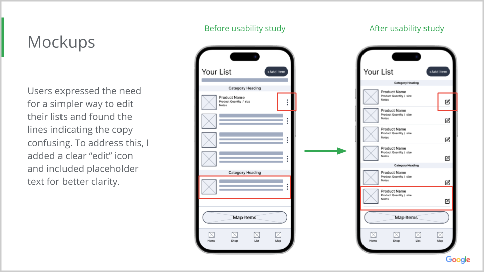
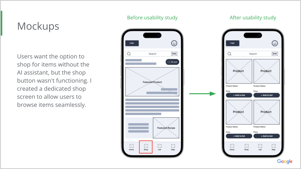
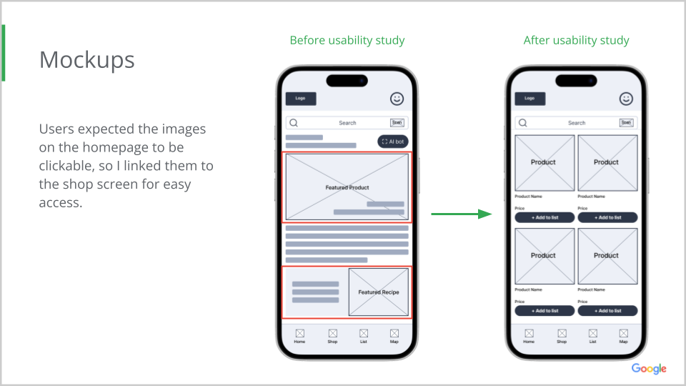
High Fidelity Prototype

Takeaways
Throughout the MarketMap project, I gained a deeper understanding of the importance of accessibility and became more proficient in applying web standards like color contrast and screen reader compatibility. I saw firsthand how small adjustments can significantly improve usability.
I also focused on creating a clean, modern design by using minimalism to reduce clutter and enhance intuitiveness. Simple layouts, white space, and a cohesive color scheme made the interface easy to navigate and visually appealing, while supporting accessibility.
Additionally, I integrated AI technology to personalize recommendations and improve user interactions, adding a dynamic, responsive layer to the app. This project reinforced the importance of prioritizing the user to create a functional, inclusive, and forward-thinking app.
